Payment Component
API version 2023-01-01 deprecating
This version will be deprecated on May 1, 2025. If your platform is on this version, you should upgrade to at least 2023-12-01 to simplify authorization and access new features.
The payment component collects sensitive payment data from your user without exposing your platform, increasing security, and decreasing PCI DSS scope. The payment component starts with a payin config call to send information in advance about the payin (amount, user name, user address, etc.).
Our components are pre-built form templates designed to simplify your integration to Rainforest while retaining your platform's look and feel and control of your merchant and user's experience.
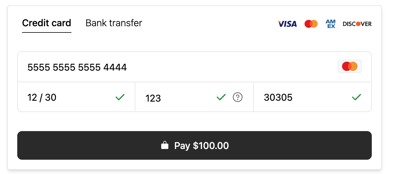
Preview of the payment component
How to embed the payment component
💸
Create a payin
Learn more about creating a payin
JavaScript bundle
Include the payment JavaScript bundle in your frontend to access the payment component.
<script type="module" src="https://static.rainforestpay.com/sandbox.payment.js"></script>
Developing locally?If you're testing your integration on an environment that does not use
localhostas the origin, you will need to first configure your browser to allow Rainforest to use secure web APIs, like cryptography, which are normally disallowed over an insecure connection. See our instructions for more detail.
Payment component
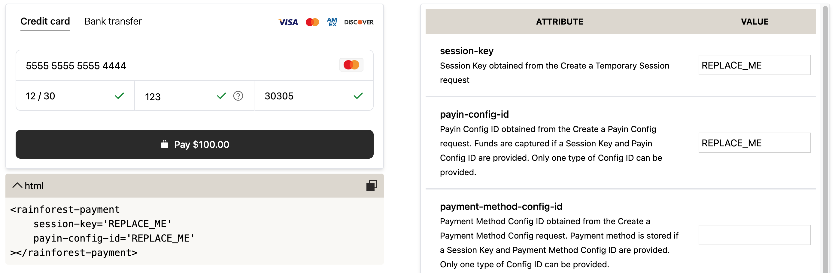
Add the Rainforest payment component with custom configuration designed in the component studio.
<rainforest-payment
  session-key="REPLACE_ME"
  payin-config-id="REPLACE_ME"
></rainforest-payment>
Session authentication
Create a temporary session to grant the payment component permissions to create a payin and pass the session-key into the payment component. This session needs the ability to create payins and read payin configs. The policy should include at least the following:
{
  "statements": [
    {
      "$.action": ["read"],
      "$.resource": ["payin_config"]
    },
    {
      "$.action": ["create"],
      "$.resource": ["payin"]
    }
  ]
}
Event listeners
The payment component will emit one of three events after attempting to process the request.
Events
| Event | Description |
|---|---|
approved | Payin was successfully captured. The event data will include information such as the payin_id. |
declined | Payin capture was declined. The event data will include information such as the payin_id. |
error | The request errored. The event data will include information about the error. Attempt to process the payment again. |
attempted | Submit button was clicked and a request will be made to create the payin. Additional event data is not included. |
Add an event listener on the approved event to obtain the payin_id from the event data:
<html>
  <head>
    <script type="module" src="https://static.rainforestpay.com/sandbox.payment.js"></script>
  </head>

  <body>
    <rainforest-payment
      id="pay-form"
      session-key="REPLACE_ME"
      payin-config-id="REPLACE_ME"
    ></rainforest-payment>
  </body>

  <script type="text/javascript">
    document.getElementById('pay-form').addEventListener("approved", function(data) {
      // save the payin_id from the data
    })
  </script>
</html>
Payment component studio
Check out the payment component studio to configure and design your payment component.
Payment component studio
Default attributes
Simply omit the props to use the default attributes:
<rainforest-payment
  style-font-size='1rem'
  style-border-color='#e5e7eb'
  style-border-radius='0.5rem'
  style-border-width='1px'
  style-button-color='#303030'
  style-button-border-radius='0.5rem'
  style-error-border-color='#C11F15'
  style-error-message-color='#C11F15'
  style-icon-color='#707070'
></rainforest-payment>
Updated 9 months ago